

Read a course dashboard
Time spent, progress by team, activity, quiz success and resources viewed: the indicators on a course dashboard.
In Track results
The dashboard summarises your learners' activity on a course: time spent, progress, quiz success and resources viewed. It shows figures by team and does not display the name of any learner.
Before you start#
- All teaching team roles can view the dashboard of a course they can open. See Trainer permissions.
- Time spent, progress, quizzes, questions and answers only cover the learners in the teams that have access to the course. Tests run by the teaching team are not included. See Give access to a course.
Open the dashboard#
- Open Trainings › your course.
- Click the Dashboard tab.
When your learners have already spent several hours in total on the course, it opens directly on this tab. Otherwise, it opens on Edit training.
The general indicators#
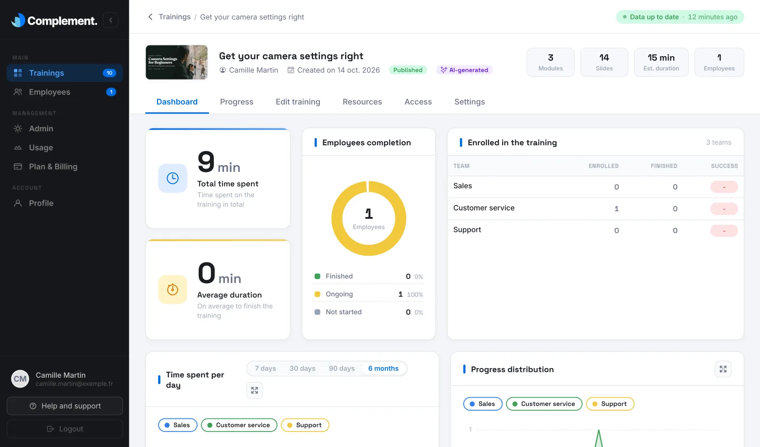
At the top of the dashboard, you find:
- Total time spent: the combined time of all your learners on the course.
- Average duration: the average time spent by the learners who have finished the course.
- Employees completion: how the enrolled learners are split between Finished, Ongoing and Not started. A learner is Ongoing as soon as they have spent time on the course. They are Finished when they have passed the quiz of every chapter.
- Enrolled in the training: one row per team, with the number of Enrolled learners, the number of learners who have Finished and the Success.
Success is the average percentage of correct answers to the quizzes for the learners who have finished the course. A dash is shown as long as no learner in the team has finished it.
Follow activity over time#
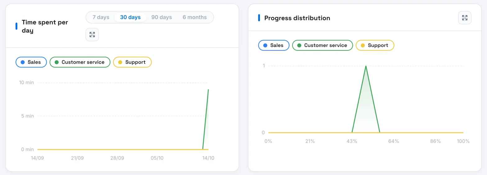
Time spent per day shows the time spent on the course, team by team.
- Choose the period: 7 days, 30 days, 90 days or 6 months. Over 90 days, times are grouped by week; over 6 months, by month.
- Click a team's name, above the chart, to show or hide it. If you have many teams, only the first ones are shown at the start.
- Hover over a date to read each team's time.
Progress distribution shows how far your learners have got. The horizontal axis represents progress through the course, as a percentage. For each point, the chart shows how many learners in each team have reached that point without going further. Many learners stuck at the same place can point to a passage that needs reworking.
To show one of these charts in a larger view, click its Expand icon.
Quiz success and resources#
- Quiz success on the first try: for each chapter, numbered under its bar, the percentage of correct answers given on the first attempt. A low bar can point to a quiz that is too difficult or a concept that is poorly explained.
- Most seen resources: the course resources, from the most viewed to the least viewed. The number next to the eye shows how many different people have opened each resource.
The other dashboard blocks#
The dashboard also shows the questions asked to the avatar, the detailed quiz results and the answers to interaction questions and surveys. See Read learners' questions and answers.
To follow your learners one by one, open the Progress tab: see Track learner progress in a course.
Was this article helpful?
Thank you for your feedback!
Thank you. Tell us what is missing through Help and support in the app, and we will complete the article.